Pictures & Graphics: GFX Battle - mcwoods Vs. Junior |
Post Reply 
|
| Author | |
Junior Shade 
Superior Member 
Aka UnaBomber Joined: 07 June 2005 Location: UK Status: Offline Points: 5015 Text Rank: Unranked Stats: 55-14-6 Form: LWWWLW |
 Post Options Post Options
") Likes(0) Likes(0)
 Quote Reply Quote Reply
 Topic: GFX Battle - mcwoods Vs. Junior Topic: GFX Battle - mcwoods Vs. JuniorPosted: 03 January 2009 at 11:57am |
|
Did'nt really know where this could go so feel free to move it..
Type - Mixtape Cover, Any Artist/Colour
Rule - Your "siganture" must be on it Due Sunday latest.. |
|
|
|
 |
|
|
Junior Shade
Superior Member
Aka UnaBomber Joined: 07 June 2005 Location: UK Status: Offline Points: 5015 Text Rank: Unranked Stats: 55-14-6 Form: LWWWLW |
Post Options
Likes(0)
Quote Reply
Posted: 03 January 2009 at 1:31pm |
|
Forgot to put in the Rule bit.. First to 5 Votes & votes must be with a small reason too! not just...
"He wins cus' i liked it more"..
|
|
|
|
|
|
|
|
mcwoods
Superior Member
Joined: 04 December 2006 Status: Offline Points: 4204 Crew: XFade: Phoenix Text Rank: Unranked Stats: 42-51-0 Form: LLLLWW |
Post Options
Likes(0)
Quote Reply
Posted: 03 January 2009 at 4:25pm |
|
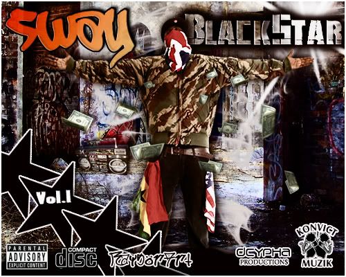
Here's mine.... Serious Jones... (thanks ikon lol)..  |
|
|
|
|
Junior Shade
Superior Member
Aka UnaBomber Joined: 07 June 2005 Location: UK Status: Offline Points: 5015 Text Rank: Unranked Stats: 55-14-6 Form: LWWWLW |
Post Options
Likes(0)
Quote Reply
Posted: 03 January 2009 at 8:30pm |
|
|
|
|
|
|
|
|
|
Swift Styles
Standard Member 
Joined: 24 September 2007 Location: East Coast, US Status: Offline Points: 2014 Text Rank: Unranked Stats: 9-4-1 Form: WWLWNL |
Post Options
Likes(0)
Quote Reply
Posted: 03 January 2009 at 9:12pm |
|
junior easy.. its just more appealing. i must say, youve gotton quite talented. even your sig is dope now.
Its the colors. woods, your sig was rather simple. serious jones placed on a background with a city and some sweet fonts. but Juniors had that eye appeal.. if i didnt know better I would of thought that was an actual album cover. it looks nice. |
|
 |
|
|
|
|
DressToKill
Superior Member

Joined: 27 June 2006 Location: Canada,New Brunswick Status: Offline Points: 6876 Crew: Lyricist Inc. Text Rank: Unranked Stats: 78-62-0 Form: LLWWWL |
Post Options
Likes(0)
Quote Reply
Posted: 03 January 2009 at 10:35pm |
|
Junior takes it
Woods like swifty said your sig is rather simplistic while Juniors is way more complex..Still a good effort though you could easilly improve with some photoshop tutorials because im sure thats how Junior gained some experience?
btw wheres Juniors self signature??I cant seem to point it out
|
|
|
The original comeback kid
|
|
|
|
|
Junior Shade
Superior Member
Aka UnaBomber Joined: 07 June 2005 Location: UK Status: Offline Points: 5015 Text Rank: Unranked Stats: 55-14-6 Form: LWWWLW |
Post Options
Likes(0)
Quote Reply
Posted: 04 January 2009 at 4:03am |
|
It says "RaysorArt" bang in the middle at the bottom..
|
|
|
|
|
|
|
|
Scotty32
Site Owner 
Speaker of Wisdom & Truth Joined: 18 October 2003 Location: North West, UK Status: Offline Points: 10491 Text Rank: Unranked Stats: 3-4-0 Form: WLLWLL |
Post Options
Likes(0)
Quote Reply
Posted: 04 January 2009 at 6:50am |
|
I disagree with the others, Id say the opposite.
Woods is more simplistic which is why its more appealing, Juniors is more complex which makes it far to busy and confusing. Woods, Id of picked a more readable font - yeah it might look good but if your doing an album cover you dont want the person stood there for half an hour trying to work out who it is - its not likely to they'll buy it - just give up an move to the next CD. Also I would of dropped the city my self. Junior - You seem to have a habbit of shoving as many logos as you can into your covers, most of those would normally go on the back of a CD wouldnt they? (eg Compact Disc and label etc) - Also Im not feelin the stars you dont notice them but they make the cover to "busy" and the "Sway" part doesnt blend well IMO, it feels disconnected and a different style to the rest of the cover - maybe changing the gradient colour Though it doesnt relate directly to the battle - I would say Junoir that you seem to be having problems picking the right colours as of late, your older sigs are alot better IMO than your newer ones (take your current for example - a hideous blue) Vote: Woods (PS this should of gone in the Graphics forum - as I've mentioned in the past, "Special Battles" is for Title matchs and 3-ways etc - if we get enough Gfx battles I may concider setting it up properly.) |
|
 |
|
|
|
|
Junior Shade
Superior Member
Aka UnaBomber Joined: 07 June 2005 Location: UK Status: Offline Points: 5015 Text Rank: Unranked Stats: 55-14-6 Form: LWWWLW |
Post Options
Likes(0)
Quote Reply
Posted: 04 January 2009 at 7:06am |
|
Scotty you would disagree cus' your a hater, so fuck you.. Whatever i do you hate on it.. Your an' idiot an' the funny thing is your always going to hate on me cus' your adiment i'm someone else, thats your problem, not mine.. In future just don't comment on my stuff cus' i already know what you have to say about it (come back in here & give your big Admin talk if you like, i could not give a fuck).. I also noticed you have not commented on the SageOne sig, but thats probaly cus' you quite like it but can't bring yourself to say you do... Fucking idiot..
And it's a Mixtape cover you knuckle child not an' Album cover.. Album covers are simplistic, Mixtape's are very busy covers..
|
|
|
|
|
|
|
|
Scotty32
Site Owner
Speaker of Wisdom & Truth Joined: 18 October 2003 Location: North West, UK Status: Offline Points: 10491 Text Rank: Unranked Stats: 3-4-0 Form: WLLWLL |
Post Options
Likes(0)
Quote Reply
Posted: 04 January 2009 at 7:54am |
|
fine - cry.
Vote retracted. an you do realise that "Special Battles" comes before "Picures and Graphics" so threads there will be seen first? - an yeah Sages sig is dope - fact remains about your current and this though. |
|
|
|
|
|
|
|
I-kontinue
Veteran 
The Sovereign Joined: 14 July 2004 Status: Offline Points: 4961 Crew: The Dynasty Text Rank: #3 Stats: 46-9-0 Form: WWWWWL |
Post Options
Likes(0)
Quote Reply
Posted: 04 January 2009 at 12:11pm |
|
You can see the clear experience difference... Jr. takes it...
Jr's... Can't compare this to your Star In The Hood... This one is all coherent, and the colors all go together very well imo... The dollars flying... Everything... Just shows more skill than woods did and makes it a more interesting cover... I have no real problem with yours... Wood's... Wasn't bad, but it was basic, which is sometimes a good thing, but Jr. just killed it... I could see yours as an average album cover, but if it was my album cover, I'd request for you to take the random city at the bottom right off... Prolly would ask to change the font to something more interesting also... Whether album or mixtape, Id'a went with Jr's though... Stay up fellaz |
|
|
|
|
Junior Shade
Superior Member
Aka UnaBomber Joined: 07 June 2005 Location: UK Status: Offline Points: 5015 Text Rank: Unranked Stats: 55-14-6 Form: LWWWLW |
Post Options
Likes(0)
Quote Reply
Posted: 04 January 2009 at 12:56pm |
|
Thanks Ikon... Holla at me if you want that cover too, i'm sure you can throw some idea's together.. |
|
|
|
|
|
|
|
mcwoods
Superior Member
Joined: 04 December 2006 Status: Offline Points: 4204 Crew: XFade: Phoenix Text Rank: Unranked Stats: 42-51-0 Form: LLLLWW |
Post Options
Likes(0)
Quote Reply
Posted: 04 January 2009 at 2:04pm |
|
thanks to all the voters..
and its not that i couldn't have done a more complex tape cover.... after i seen the initial image of serius, it looked like quite a solitary figure.. so i wanted to mirror this by keepin' it limited... by adding some shade to the areas, and by increasin' his colour and glow... also its not just a random city, its his home city... and the look he's givin' in the pic looks like he's remincisin', and the shot of his city in colour looks like a metaphor for a dream bubble... on some simple yet complex shiz lol.. not that im complainin' about the votes, i fully expected junior to kill it, and he did, a great piece, looks professional.. still prefer mine tho :).. |
|
|
|
|
Junior Shade
Superior Member
Aka UnaBomber Joined: 07 June 2005 Location: UK Status: Offline Points: 5015 Text Rank: Unranked Stats: 55-14-6 Form: LWWWLW |
Post Options
Likes(0)
Quote Reply
Posted: 04 January 2009 at 3:01pm |
|
Props Woods.. Keep working on your skills and you'll soon be turning out "professional looking" stuff too...
|
|
|
|
|
|
|
|
I-kontinue
Veteran
The Sovereign Joined: 14 July 2004 Status: Offline Points: 4961 Crew: The Dynasty Text Rank: #3 Stats: 46-9-0 Form: WWWWWL |
Post Options
Likes(0)
Quote Reply
Posted: 04 January 2009 at 3:46pm |
|
When I said random city, it didn't really matter whether it was his city or not... just didn't seem to blend well with the b/g is what I meant.
|
|
|
|
|
Kay B
Superior Member
Joined: 28 June 2005 Location: Watford Status: Offline Points: 9428 Crew: Lyricist Inc. Text Rank: Unranked Stats: 58-32-0 Form: LLWWWW |
Post Options
Likes(0)
Quote Reply
Posted: 04 January 2009 at 3:56pm |
|
Pretty one sided as i expected tbh
Woods - Not bad at all for a first try but as already been pointed out its very plain and not blended well, i liked the idea you had for the design but it needed better execution, also the fonts were very plain and poor choices im guessing thats because your working with the basic fonts?....If you wanna carry on doing gfx which id say to since its a great time waster, look into downloading better fonts as the titles and style of title add alot to any gfx. Junior - This was nice, i always have the same problems with your designs tho as i explained to you on msn, one thing i dislike (still) is the text but i agree with what you said about it being hard to work with so u worked it well with what you had, there was also too much going on, i liked the general design of the cover with the stars and shit, and glad u chose sway (dude don't get the respect he deserves) design looked professional though i would of changed a few bits, it was generally nice Vote - Junior |
|
 |
|
|
|
|
SwordedStylez
Superior Member
Joined: 16 August 2007 Location: UK Status: Offline Points: 4922 Audio Rank: Unranked Stats: 3-0-1 Form: WWWN |
Post Options
Likes(0)
Quote Reply
Posted: 05 January 2009 at 2:27am |
|
If this isn't over then my vote goes to woods. The simple fact of the matter for me is that woods put together a fairly simple yet artistic cover where the focus was on teh artis in question. Junior did alot of neato stuff but it just looked like a collage of all sorts of things, if it wasn't for the name I wouldn't even say it looked remotely like a sway mixtape should look. Plus, those stars are gay as fuck haha. Anyways, as I say, if this aint done yet my vote goes to WOODS, because his was nice and more like an artistic piece than a little girls collage with stickers thrown all over a poster. |
|
|
Music
Ink - Always remembered, never forgotten (as a fake as fuck piece of shit who tried to steal 2 persona's) |
|
|
|
|
Post Reply
|
|
 Tweet
Tweet
|
| Forum Jump | Forum Permissions You cannot post new topics in this forum You cannot reply to topics in this forum You cannot delete your posts in this forum You cannot edit your posts in this forum You cannot create polls in this forum You cannot vote in polls in this forum |
|
 Topic Search
 Topic Options